Five Checkpoints for Spotting Graph Manipulation
Truncated Y-axes, distorted proportions, cherry-picked data, correlation-causation confusion, and sample size fallacies — this article dissects five common graph manipulation patterns and provides practical checkpoints for critically reading data visualizations.
TL;DR
- Graphs are often perceived as symbols of objectivity, but visual tricks such as Y-axis truncation and aspect ratio manipulation are widely used to steer readers' judgments
- Finland has embedded media literacy in its national curriculum since 2013, teaching information literacy from age 6 — while Japan lacks systematic education in critical graph reading despite world-leading math scores
- Building the habit of checking five points (Y-axis, proportions, timeframe, causation, sample size) empowers anyone to structurally detect graph manipulation in everyday media
What Is Happening
The reality that visual tricks in graphs pervade everyday media, and the growing importance of data literacy
"Look at this graph — the numbers prove it."
Graphs accompanied by such declarations are shared daily across social media timelines and news articles. Charts function as tokens of objectivity, lending a persuasive force that text alone cannot muster. But is that objectivity genuinely warranted?
Multiple surveys suggest that a significant share of adults have shared misleading visuals online without realizing it. The problem is not limited to deliberate "lies." More often, it is the structure of the graph itself — unintentionally constructed — that distorts readers' judgments.
In 1954, Darrell Huff published How to Lie with Statistics. Graph tricks, biased samples, the trap of averages — the techniques he identified over 70 years ago are still being replicated in new forms in the digital age.
This article introduces what we call "graph literacy" — the ability to critically read data visualizations, including graphs — by narrowing down the most frequently encountered manipulation patterns to five. Other misuse patterns exist, but habitually checking these five is the essential starting point.
Background & Context
Comparing Finland's media literacy education model with Japan's current state, and systematically explaining five manipulation patterns
The International Gap in Media Literacy Education
The "immunity" to graph manipulation varies dramatically depending on education.
The Open Society Institute Sofia publishes the Media Literacy Index. Finland has maintained the top position every year since the inaugural 2017 edition, scoring 74 out of 100. Denmark (73) and Norway (72) consistently round out the Nordic-dominated top ranks.
Finland's strength lies in institutional design. Finland established its national media literacy policy (Good Media Literacy: National Policy Guidelines 2013–2016) in 2013 and integrated media literacy across all educational stages, including early childhood education from around age 3. In pre-primary education (around age 6), children take on a more active role in learning to distinguish true from false in media. Six-year-olds learning "how to spot fake news" is not hyperbole but a fact grounded in the actual curriculum. And it extends beyond schools — libraries, newspapers, NGOs, and businesses collaborate to build a media literacy ecosystem.
What about Japan? In PISA 2022, Japan's mathematical literacy ranked 1st among OECD member countries (536 points), placing computational ability at a world-class level. However, education in "critically reading statistical graphs" has not been systematized. In February 2026, MEXT discussed "Current Status and Issues in Media Literacy" at a curriculum council session, highlighting the importance of information literacy in the age of generative AI — but concrete curriculum development is still ahead.
Japan can calculate, but it cannot yet spot a graph's deception — that is the current reality.
Five Manipulation Patterns
The following sections explain each pattern in turn.
Checkpoint 1: Does the Y-Axis Start at Zero?
The most frequent and most overlooked technique is Y-axis truncation. By starting the Y-axis at a midpoint rather than zero, minor differences are visually amplified.
Consider a product's customer satisfaction score shifting from 48% to 52%. On a 0%–100% Y-axis, the change occupies just 4% of the graph's height. But compress the axis to 45%–55%, and the same change fills roughly 40% of the visual space. It looks like a "surge" — readers perceive a greater change than actually occurred. This technique appears everywhere, from corporate advertising and investor presentations to political approval-rating coverage.
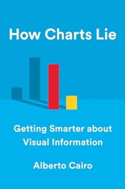
Alberto Cairo calls Y-axis truncation "the most universal chart lie" in How Charts Lie (2019). Crucially, this does not always stem from malicious intent. Excel's default settings auto-adjust the Y-axis to the data range, so truncation can occur without the creator even noticing.
Check: When you see a graph, first verify where the Y-axis begins. If it does not start at zero, mentally recalibrate the visual change against the actual magnitude of change.
Checkpoint 2: Are Areas and Proportions Accurate?
Pictograms and area charts demand even more caution than bar charts.
To represent a value that is 2× larger, doubling a figure's height is correct. But doubling both width and height quadruples the area. In 3D, the volume becomes 8×. Since readers intuitively gauge "quantity" by area or volume, they perceive 2–4× the actual difference.
Pictograms used in newspapers and TV reports (human figures, coins, etc.) are particularly susceptible to this trap. Drawing a coin twice as large to represent double the budget creates an area 4× larger — readers unconsciously perceive "four times the gap."
Check: For pictograms, circles, and bubble charts, verify that the "ratio of values" matches the "ratio of visual areas."
Checkpoint 3: Is the Time Period or Range Arbitrary?
Cherry picking means presenting only convenient segments selected from the complete dataset.
A stock price that has been flat over ten years can appear to be "surging" if only the most recent three months of upswing are displayed. Conversely, clipping only a decline makes it look like a "crash." The essence of cherry picking is that diametrically opposite conclusions can be drawn from the same data.
In corporate IR materials and official government statistics alike, the choice of baseline year dramatically shifts impressions. Reporting "improvement vs. same month last year" when the prior year was a pandemic trough makes "improvement" an inevitability — not necessarily a "recovery." When a mutual fund advertisement touts "X% returns over the past three years," the starting point alone can make the number look however you want.
Check: Examine the graph's time axis range. Ask "Why this period?" and, whenever possible, look up longer-term data yourself.
Checkpoint 4: Are You Confusing Correlation with Causation?
Tyler Vigen's "Spurious Correlations" project juxtaposes graphs showing that "U.S. science spending" and "hanging suicides" are highly correlated — illustrating how conflating correlation with causation yields absurd conclusions.
Dual-axis charts are particularly prone to inducing this confusion. Placing two variables with different scales on left and right axes and overlaying two lines leads readers to unconsciously infer causation. Yet both variables may simply be driven by a common third factor (a confounding variable).
The correlation between ice cream sales and drowning deaths is explained by the common factor of "summer." Ice cream does not cause drowning.
Check: When shown a relationship between two variables, ask: "Is there a third factor?" "Is there a temporal sequence?" "Has this been verified through an intervention study?"
Checkpoint 5: Is the Sample Size Adequate?
"90% of users are satisfied" — this number is credible if 10,000 people were surveyed, but meaningless if the sample was only 10. A small sample size undermines statistical reliability at its foundation.
The problem is that graphs do not visually distinguish between large and small samples. A bar graph showing "90%" looks identical whether it represents 10 respondents or 10,000.
When advertisements or press releases claim "X% experienced the effect," you need to verify the sample size, the methodology (in-house vs. third-party survey), and the population definition.
Check: Look for annotations and sources accompanying the graph. Statistics that do not disclose sample size (n=) should be received with a substantial discount on credibility.
Reading the Structure
Positioning graph literacy as a civic foundation and presenting a practical checklist
Graph Literacy Is Not "Seeing" — It Is "Questioning"
The common thread across all five checkpoints is that graph literacy is not about "seeing" graphs, but about "questioning" them.
Graphs are, by nature, tools for making complex data more comprehensible. But when that "clarity" works to distort judgment, the tool becomes a weapon. The point is not to reject graphs, but to cultivate the habit of asking what a graph is not showing.
A review of psychological research demonstrates that "humans have systematic biases in how they perceive visual representations of data". Even when people know a Y-axis is truncated, they tend to overestimate differences because of the visual impression. In other words, "knowing" is insufficient — checks must become habitual.
Data Literacy as a Civic Foundation
What Finland demonstrates is that media literacy is not "special education" but "foundational civic knowledge." Graph literacy is likewise a skill that should be acquired by all citizens, not just specialists.
The following five items are proposed as a checklist to run through every time you encounter a graph:
- Y-Axis: Does it start at zero? If truncated, what is the actual magnitude of change?
- Area/Proportions: Do figure areas match the value ratios?
- Timeframe/Range: Why was this period chosen? What does the long-term data show?
- Causation: Are you mistaking correlation for causation? Is there a third factor?
- Sample: Is the sample size disclosed? Is the survey methodology appropriate?
This checklist applies not only to graphs but to statistical data in general. The starting point of data literacy is not "it's correct because there are numbers" but "because there are numbers, question where those numbers came from."